2023
UI/UX case study
Seatwise App
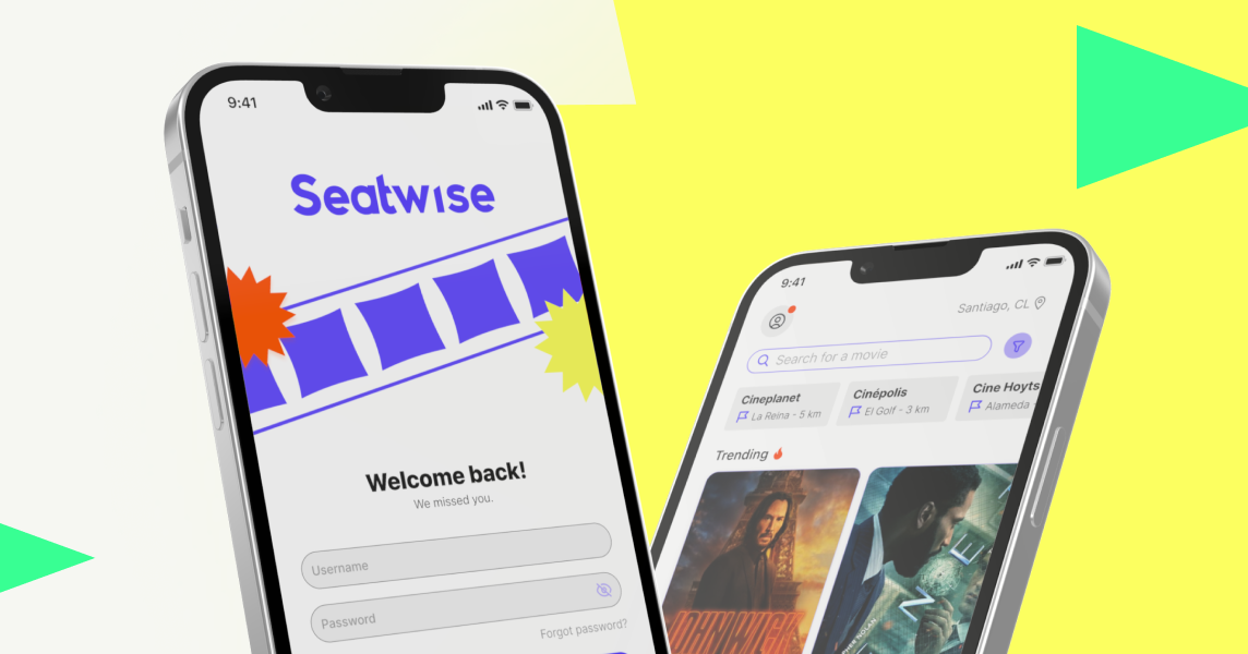
This project is a seat reserving app for cinemas, made for Coursera UX professional certificate in the pre AI era.
This project is at prototype level. It is a seat reservation app created for the Grow with google UX Professional Certificate. You can find the full project process and details in Behance.
The objective
It streamlines the experience of discovering films, selecting seats, paying, and sharing tickets in Santiago, Chile.
Features
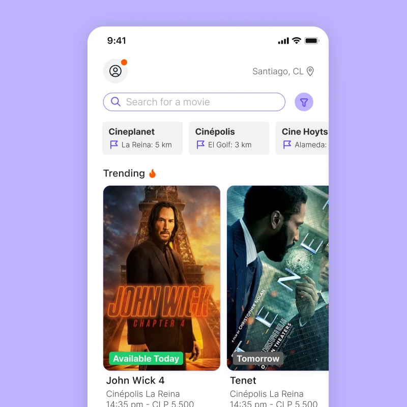
The app shows listings from nearby cinemas and acts as an intermediary with their platforms, making it easy to compare showtimes and reserve the best available seats.
How did it start?
There was a general lack of attention to user experience across cinema reservation systems in Santiago, Chile. The flow for selecting seats was outdated and fragmented the information in ways that exposed users to avoidable errors.
For this reason, this project was born in order to improve the seat reservation process that users face when buying and choosing tickets for cinemas.
The process
The design began with Discovery, where both UX and UI research were conducted to understand user needs. There were two main problems: Checkout procecess had errors, and e-tickets were difficult to share or store.
During the Analysis phase, user personas and flows were created to map out how users navigate the reservation process. This was followed by Wireframing, which laid the foundation for interface structure.
Discovered Pain Points
Ease of use
Most platforms in Chile have core tasks that feel unrefined.
Ticket sharing
Ticket sharing isn't fully solved. The user is expected to handle it on their own.
Checkout process
Checkout flows aren't straightforward or user-friendly.

After the first draft and low fidelity prototype were done, I noticed a huge gap between the movie details and the seat selection. The cinema location, details and room availability were also missing.
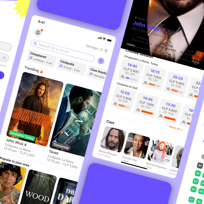
Then, after several iterations and user testing, the final result included much more detail, especially on the room capacity screen.
The results
The main page
The cinemas were added at the top of the main view, so users could see their closest option. A list of trending movies was added too, so if a user wants to find a specific movie and check its availability, they can do that as well.

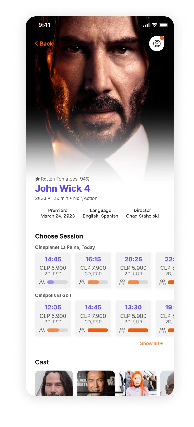
The seat selection view also has a vertical overflow in case the seat amount isn't fully visible on mobile devices.
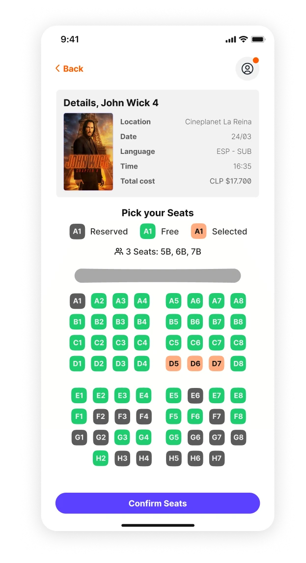
The checkout process show a summary of the movie tickets and location. The user can change its payment method here as well.

After the checkout, the user will be able to store or share the tickets if he isn't going alone.
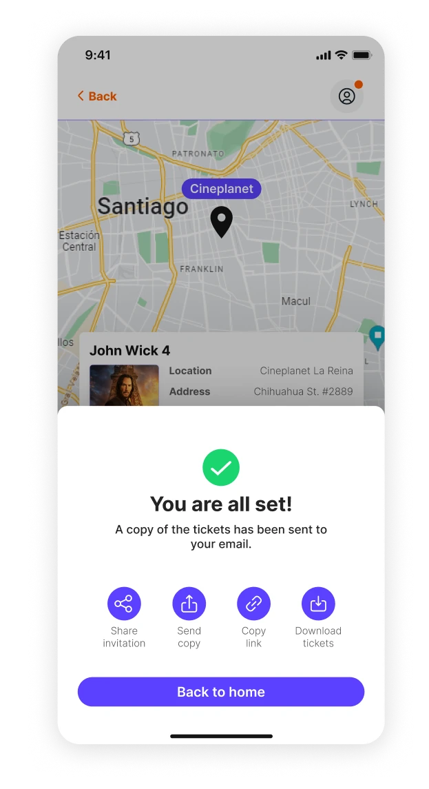
The Design System
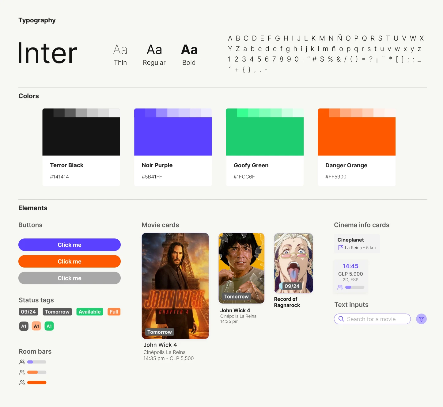
A small granular system was made with vibrant colors. It focuses on consistent UI components and branding. Includes buttons with varying colors to highlight different actions, status tags that visually indicate ticket availability, and room bars for displaying cinema room occupancy.
The system also incorporates movie cards for presenting film information, and text inputs designed for intuitive searching.