2024
Design and UI
Ninja Hubs landing and ads
Conversion oriented landing and ads design for Ninja Hubs
Design for Ninja Hubs
Landing page and ad design for Ninja Hubs, an all-in-one logistics and supply chain software platform based in Chile that automates and centralizes last-mile delivery for e-commerce businesses.
This one was a great experience to work on. The company already had basic assets and a one-page site on Wix. I teamed up with a marketing expert (Aguante Pancho!) to build a baseline marketing strategy and create ads for the startup.
Understanding the business
Something no one tells you when you start designing is that hands-on knowledge is best. The first thing I did was sit down with Andrés, one of the co-founders, to understand their product, market fit, and operational details. At the time, they needed a concise one-pager to drive all their conversion strategies. This process also helped me get a clear grasp of their brand message.
The brand
They help small businesses grow and thrive. They aim to project agility and fluidity, viewing themselves as an interconnected network that joins all these nano-hubs (Ninja Hubs) together.
The ads
We defined one core message: “Digitalize and optimize your logistics operations with our new multicourier technology.” My approach for the ad variations was built around setting up an immediate A/B test to see which visual style performed better. From there, I took the concept of an interconnected web and applied it in two distinct ways.
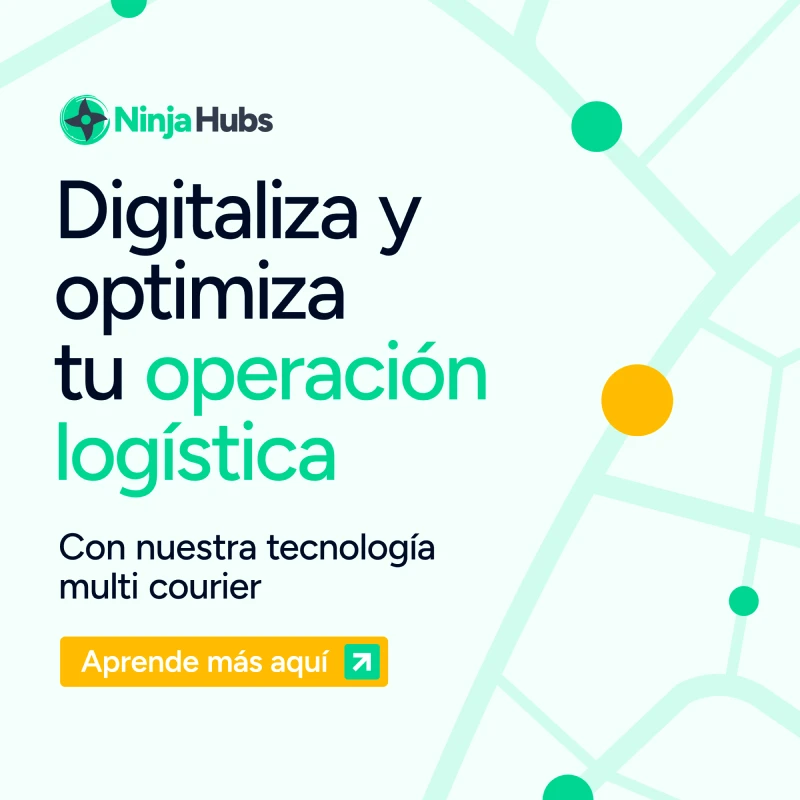
The first variation relied strictly on text, with the network styled to look like streets. I aimed for something easy to read, keeping in mind that you only have a few seconds of attention when serving ads.
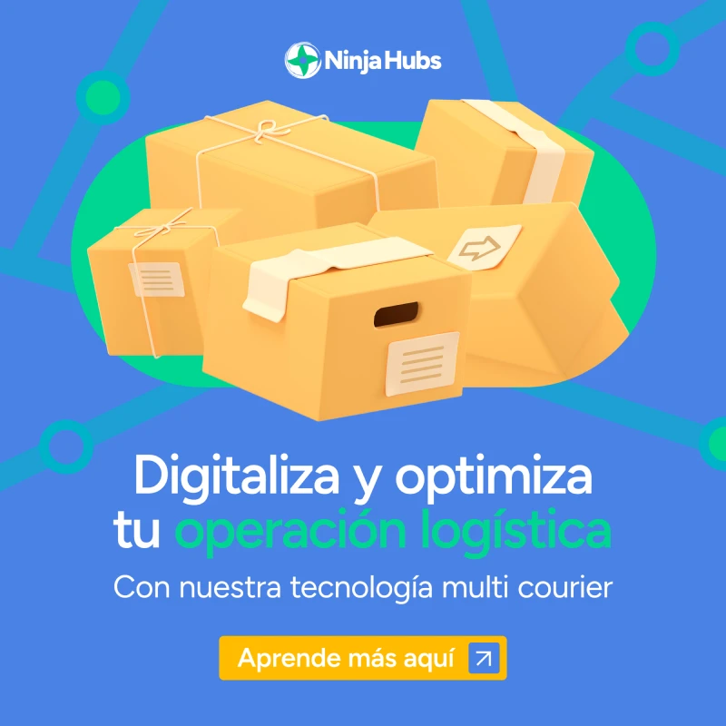
For the second variation, I used boxes. The universal visual language for commerce and logistics revolves around moving goods. What kind of goods? It doesn't matter, as long as they arrive in boxes. I chose boxes because they felt immediately recognizable to potential users, making them the central element of the design.
Conversion oriented landing page
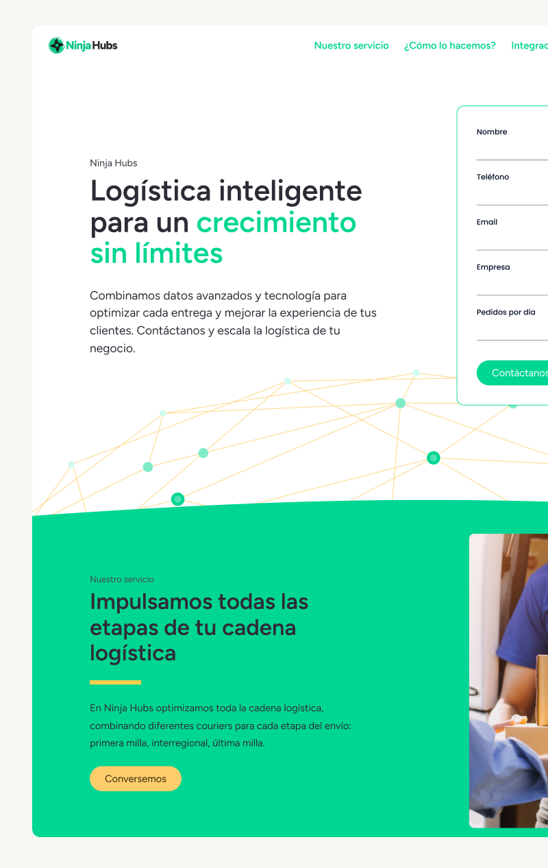
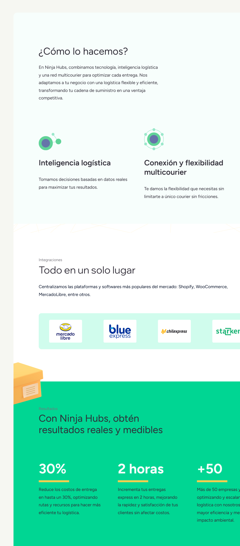
I tried to keep it simple. We started with a wireframe that I validated with Andrés and the rest of the team. It was short and straightforward, nothing too fancy. They needed something launched quickly, so I focused on meeting the deadline while still creating a site with a coherent structure. Also, keep in mind this was the pre-AI era haha. (They evolved to a fully fledged now, you can check it out). Here you can see the first version of the wireframe and some sneak peeks of the landing.
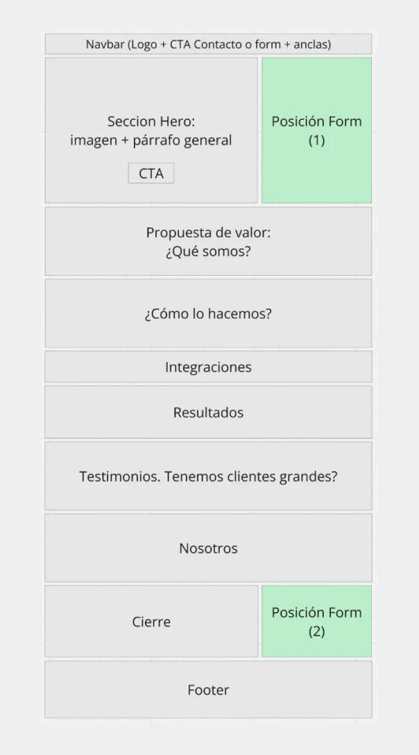
As you can see, the network concept still exists at the hero section at the background, this was a small hint I wanted to add.